Overview

Overview
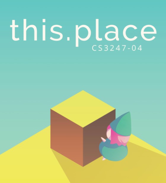
this.place is a puzzle platform game that incorporates platforming and block pulling. It was developed during the course of CS3247 Games Development in AY2017/2018 Semester 2. In the 12th School of Computing Term Project Showcase (12th-STePS), this.place achieved 2nd Place.
My Role
Programmer, mainly responsible for features such as:
- Player movement
- Camera control
- Controller integration
- and User interface
Duration
January 15, 2018 - April 23, 2018
Project Team
Koh Lewis
Stanley Tay
Nicholas Chua
Tan Yi Jing, Jolyn
Yeo Jun Kai
Saho Kobayashi
Tools
Unity
Github
Links
Creating an Immersive World
When creating this.place, our team wanted it to be a world which the players can get sucked into. Our team worked hard on the beautiful environments which players will encounter in our game. We wanted the players to feel as if they were a part of this world. We did this in two ways:
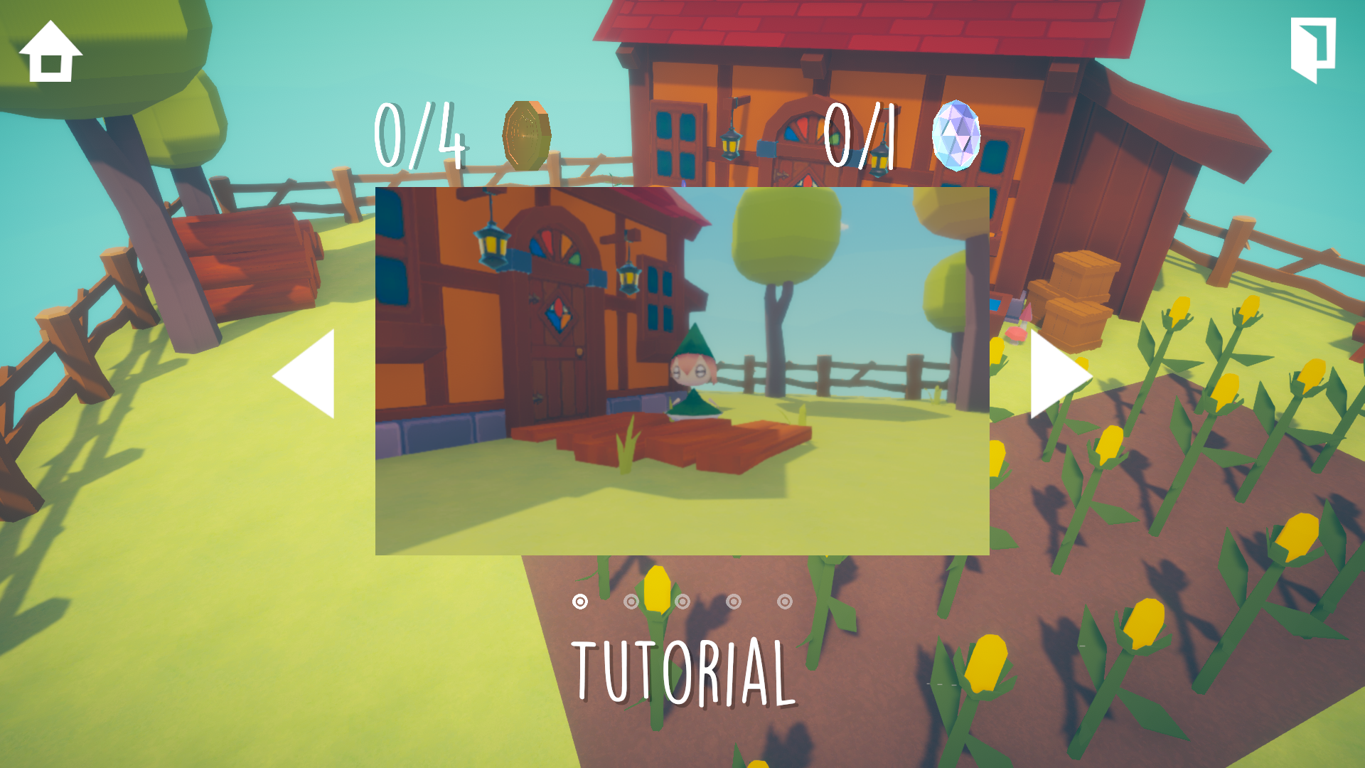
Firstly, the menu is an overlay which appears on top of the game. Due to this, the player is always there in the environment. We did this to make the player feel like they were a part of the world, as they are physically always in the map. By doing this, we reduce times where the players feel disconnected from the in-game character.
Secondly, we showcase the world by making the camera rotate slowly while the game is paused. Since there is no detached title or pause screen, the game world is always on-screen. This was also useful, as we demoed the game at STePs. As such, people could still see parts of the world when walking past, even if noone was playing. By making the camera rotate, we can show how expansive the world is, and give the players a chance to notice and appreciate small details which my team put into it. The small details showed that care and attention was paid when designing the levels, and gave players a reason to explore furthur through the stages of the game.
Guiding the Player

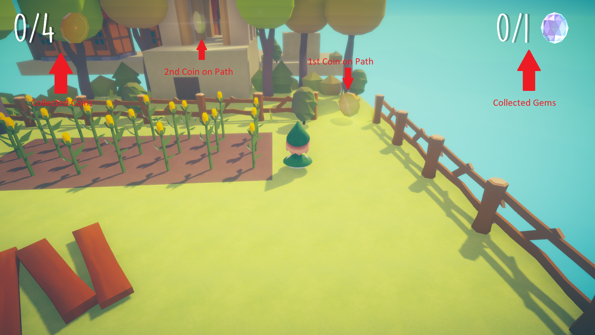
With such a large world to explore, We needed to make sure that players could confidently know that they were making progress towards the goal. We put in collectibles to guide the players along the correct path. We used two types of collectibles: coins and gems.
Coins show the main path towards the goal. They are out in the open and are very noticable, due to their shininess and rotation. Newer players can safely follow these coins and make it through the level, without having to worry about other things happening in the environment.
Gems are off the beaten path, and are usually hidden in hard-to-reach places. For more experienced players, these gems are a challenge for them to try and collect. They give an incentive for players to explore the environment and experience every part of the game.
Both of these collectibles can be tracked by the user interface. This lets players know that they are making progress as they play the game. It also gives them something to aim for, as they try to make it to the end of the level.
Keeping Track of Progress

We have a stage select screen, to allow players to jump from stage to stage. This allows users to experience any stage, even if they had difficulty clearing a previous level. In addition, the coins and gems collected from previous stages are recorded and noted down here. Players can see the collectibles they had obtained and missed, and can enter the stage again to try and collect the ones they have missed. If they had already collected the coins or gems, they will appear slightly dimmed, so that they player knows which ones they had previously collected and can aim for other ones. Showing all of the coins and gems gives the player an overarching goal of collecting everything while playing the game, and tells the player that we care about their progress and achievements in the game.